Interactive: CSS Cheat Sheet
Nov 21, 2022 - 7 min read
The Problem
Do you know what really grinds my gears? Forgetting basic flexbox CSS, that's what. For this reason, I have created a CSS cheat sheet for myself and anyone else who might find it useful. The goal is two-fold.
to have a single page that I can reference when I forget how to do something in CSS. I'm sure I'm not the only one with this problem, so I'm sharing it with you.
To remember this visually. I'm a visual learner, so this is my beautifier approach to CSS that made it stick.
Entree
CSS Specificity
- inline-style
#id selector.class selector- element selector (e.g.
p,div,h1)
Order of shorthand values for Padding and Margin
- top
- right
- bottom
- left
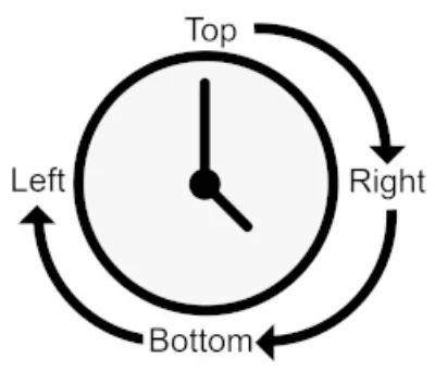
Smaller elements look best with more considerable padding on the x and less on the y-axis.
To prove this point, let's look at how to create a rounded button in CSS with 3d css text.
As you can see from the example above, first 3d css text button looks more elegant.
CSS relational values
Em Values default to 16px, calculate target value/default value of the parent. Em values change regarding font size.
Rem Values (root em) is taking values in relation to root value
 :root {
    font-size: 1em;
}
Rule of thumb: use rem for font-size, em for padding & margin, pixels for borders and % for width & height of containers.
Function calc helps combine relational values of different types.
 :root {
font-size: calc(0.5em + 1vw);
}
Image object-fit
Oh, the amount of times I've had to google this. object-fit is a CSS property that allows you to control how an image fits into its container. It's a great way to ensure your images are responsive and look good on all screen sizes.
 img {
    object-fit: fill; /* default */
    object-fit: cover; /* expands image to fit the block, think Album Cover */
    object-fit: contain; /* expand to the elements with respect to its size */
}
Text has higher padding than the element itself. To fix this: multiply by 1.4, i.e. 6px on top and bottom.
Flexbox CSS Cheat Sheet
I love this flexbox cheat sheet! It provides an intuitive layout of flexible components.
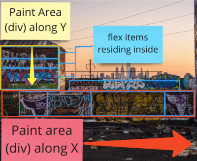
Its main strength and ease of use is one-dimensional positioning. Think of your div container as a giant graffiti wall. You can paint your graffiti anywhere, but only on the X (starting from the left) or Y (starting from the top) axis.
Steps to create a flexbox:
display: flex;on the parent container- If required, define
flex-direction(default isroworX axis) - If required, define margin (outer) or padding (inner) or flex value
Flexbox Cheat Sheet
flex-direction: row ⬌ , column ⬍flex-wrap: nowrap, wrap, wrap-reverse. // Defines whether the elements in the container will be moved to a new row (column, depending on flex-direction)justify-content: flex-start, flex-end, center, space-between, space-around. How elements are positioned along the main axisalign-items: stretch, flex-start, flex-end, center, baseline. How elements are positioned along the opposite axis.align-content: flex-start, flex-end, center, stretch, space-between, space-around. If flex-wrap is active, it assigns the padding of rows along the opposite axis.
Flex elements properties:
flex-grow: single number, a factor of growth of an elementflex-shrink: single number, a factor of deduction of an elementflex-basis: length or %, defines the initial size of an elementalign-self: auto, flex-start, flex-end, center, stretch, baseline. Defines adjustment of the element along the opposite axis.
Grid Cheat Sheet
Grid lunch - what a delight! Though a bit harder to grasp, CSS Grid is excellent for two-dimensional layouts (both: x ⬌ and y ⬍ ). You set elements in predefined areas inside the grid.
Each element in the grid should be a child-to-grid container.
Basic setup:
 display: grid
grid-template-columns: 1fr 1fr 1fr /* 3 cols of same width */
grid-template-rows: 1fr 1fr /* 2 rows of same height */
grid-gap: 0.5em 1em
4 essential terms:
- Grid Line: forms the structure of the grid. grid-gap goes above the grid line
- Grid Track: distance b-n two Grid Lines. Has vertical and horizontal tracks
- Grid Cell: unit in a grid, i.e. table cell
- Grid Area: area of a few table cells
To position elements in the grid, you can use the alternative syntax: grid lines or grid areas. I like grid areas more, but it depends on the task.
 .container {
  grid-template-columns: [left-start] 2fr
               [left-end right-start] 1fr
               [right-end] /*defined and named 3 grid lines */
  grid-template-rows: repeat(4, [row] auto)
}
.main {
  grid-column: left /*takes space from left-start to left-end */
  grid-row: row 3 / span 2 /*places the element after 3rd row and takes 2 rows */
}
Additional CSS cheat sheets
For dessert, I'm presenting tailwind CSS. Once you know this cheatsheet by heart but still forget some stuff like I sometimes do, you will love tailwind. A day of learning curve will immensely speed up development time.
If you want to improve your knowledge of CSS further, I highly recommend looking at CSS Secrets by Lea Verou. It's a fantastic book on CSS for both novices and veterans alike.
In conclusion: here are a bunch of links and tips:
- CSS basic styling for a page
 :root {
box-sizing: border-box;
--gray-100: #f3f4f6;
--gray-200: #e5e7eb;
--gray-300: #d1d5db;
--gray-400: #9ca3af;
--gray-500: #6b7280;
--gray-600: #4b5563;
--gray-700: #374151;
--gray-800: #1f2937;
--gray-900: #111827;
/* Google tailwind colours for setting your colour variables */
}

\*,
::before,
::after {
box-sizing: inherit;
}

body {
background-color: var(--gray-300)
font-family: Roboto sans-serif;
line-height: 1.4em /* up to 1.6em; */
letter-spacing: 0.01em;
}

h1, h2, h3, h4 {
font-family: Kurale, serif;
letter-spacing: 0.03em;
}

body * + * {
margin-top: 1.5em;
/* This one is called lobotomic owl, which aims for any element that goes after another. So all elements do not equal the first daughter element of the parent. You can read about it in the link at the of the article */
}

.container {
max-width: 1080px;
margin: 0 auto;
}
Grid Interactive Exercise
After a decent meal, I challenge you to create a grid and utilise some tricks here. Set a timer and implement a solution like in the final screen. Feel free to peek at the final solution after the time runs out. If you find this article helpful, you can press print and save this css cheatsheet as pdf download.
Your playground
Final Result
What is the number one lesson you have learned from this article?
Recent publications
Found this article helpful? Try these as well ☺️